 This is a piece done by graphic designer and typographer Neville Brody. It is a design for the "Fuse" exhibition. Brody became very popular in the 1980s and is still popular today. Looking at this poster, there is a lot of emphasis on the white shapes and forms. Looking closer, it's apparent that the shapes are actually counterforms of letters and abstractions that create a negative space that lets the viewers mind complete the words and what they say themselves. The counterforms and shapes resemble a lava lamp almost, and when you step back and look at the background images, they are very dark vague shapes that also resemble a lava lamp and reinforce that idea. The color scheme is very neutral excluding the white counterforms and shapes. This creates a contrast between forground and background and also creates a hierarchy between the white letters and forms, and the goldenrod shapes behind it, which if observed close enough, say the name "Brody." This piece overall is very abstracted, but done so in a way that it is visually exciting to look at and try and read.
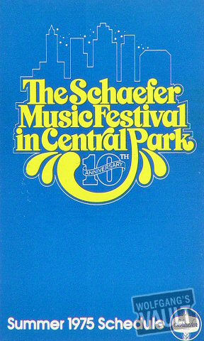 This poster was created for the Schaefer Music Festival held in Central Park in 1975. I'm not exactly sure who created the poster because I couldn't find it. The festival featured bands such as Aerosmith, J. Geils Band, and The Bee Gees. The poster is simple, yet still type dominant. The display font is bright yellow on a teal background which creates contrast and is very eye-catching. The display type is also a style which is very fitting for the time. It gives an image and idea of openness and fun. The yellow graphics coming off of the looping P also kind of look like a water fountain, which is a good reference to Central Park. The blue background could also make reference to the blue sky of central park. There is also a thin white like that creates a silhouette of the city of New York. The thin line also outlines the display type which to me is a symbol of unity of the bands and the city itself. Overall, the design is pretty simple, but it gets it's idea across very easily, and is also eye catching and does what it's supposed to.
 ghastly
 daunting
 gruesome
 clean
clean edgy
edgy


