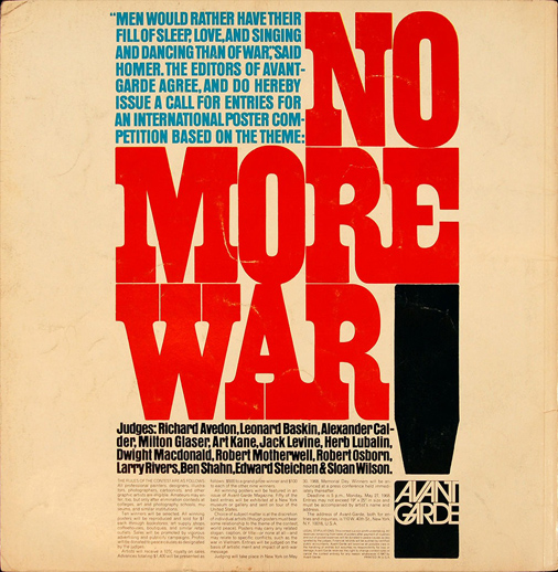
I found this piece on Encyclopedia Britannica while searching for post-war graphic design in the United States. The piece is a poster designed by Herb Lubalin for an anti-war competition that was to be sponsored by Avant Garde magazine. The first thing to by noticed about this poster is the larger red text reading "no more war" that takes up over half of the poster. This is meant to grab attention and bring passers by in to take a closer look at the contents of the poster. There is also a contrast in size and color between the headline and the type in the upper left of the poster. Not only does this create a heirarchy of information, but the text itself forms what resembles and American flag which takes a poster meant as a call to action for the competition and turns it into an anti-war poster itself. The size variations within the poster also gives a sense of movement throughout which keeps the readers interest and urges them to continue all the way through. There is also organization of information through the use of a grid system and columns which makes the text easy to read. The name of the magazine is placed within the large black dot of the exclamation point which helps to make the weight of the dot not as heacy and a main point of focus. The fact that the dot of the exclamation point is more weighted at the botton and located at the very bottom of the page also serves as an ending point to the poster and included text. This could also be interpreted as a reference to what the poster is asking for itself, which is the ending of the war. This piece is very successful in taking the information provided and presenting it in a way that is easily understood while still being visually interesting and sending out a strong message.