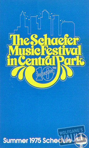
 This poster was created for the Schaefer Music Festival held in Central Park in 1975. I'm not exactly sure who created the poster because I couldn't find it. The festival featured bands such as Aerosmith, J. Geils Band, and The Bee Gees. The poster is simple, yet still type dominant. The display font is bright yellow on a teal background which creates contrast and is very eye-catching. The display type is also a style which is very fitting for the time. It gives an image and idea of openness and fun. The yellow graphics coming off of the looping P also kind of look like a water fountain, which is a good reference to Central Park. The blue background could also make reference to the blue sky of central park. There is also a thin white like that creates a silhouette of the city of New York. The thin line also outlines the display type which to me is a symbol of unity of the bands and the city itself. Overall, the design is pretty simple, but it gets it's idea across very easily, and is also eye catching and does what it's supposed to.
This is a blog that will follow my thoughts and feelings on my Design for the Web and Devices class.
Monday, April 26, 2010
Form and Content 2 (1970s)
 This poster was created for the Schaefer Music Festival held in Central Park in 1975. I'm not exactly sure who created the poster because I couldn't find it. The festival featured bands such as Aerosmith, J. Geils Band, and The Bee Gees. The poster is simple, yet still type dominant. The display font is bright yellow on a teal background which creates contrast and is very eye-catching. The display type is also a style which is very fitting for the time. It gives an image and idea of openness and fun. The yellow graphics coming off of the looping P also kind of look like a water fountain, which is a good reference to Central Park. The blue background could also make reference to the blue sky of central park. There is also a thin white like that creates a silhouette of the city of New York. The thin line also outlines the display type which to me is a symbol of unity of the bands and the city itself. Overall, the design is pretty simple, but it gets it's idea across very easily, and is also eye catching and does what it's supposed to.
Subscribe to:
Post Comments (Atom)
No comments:
Post a Comment